Miscellaneous:
Color, philatelist and philately
Scientific treatise on color and color shades from the perspective of science and human perception and their significance in philatelic studies.
Color, philatelist and philately
Abstract
Color shades are an important aspect of philatelic study for a number of reasons. The two most important of these are the identification of specific printings and printers of stamp issues, and the discrimination of fraudulent stamps. For nearly a century, the identification of color shades has been done using two basic methods: firstly, by having reference collections of shades that can be compared to an unknown specimen; and, secondly, by training individuals with innate or intrinsic skills in color-matching to recognize the accepted shades as defined by earlier generations of such color experts. The present article is a treatise on colour, the importance of colour for the philatelist as well as for the whole philatelic group.
Color and coloration
Ten million! That is the number of different colors that we can distinguish according to a (un)reliable estimate. It is therefore not surprising that we cannot remember colors well enough to be able to identify a specific shade. The activity mentioned involves three basic components of color: light sources, objects illuminated by them, and observers. Color therefore involves not only material sciences such as physics and chemistry, but also biological sciences such as physiology and psychology, and its use involves various applied sciences such as architecture, dyeing, color technology, and lighting engineering. Color measurement is therefore a subject that must have a broad basis and wide application.
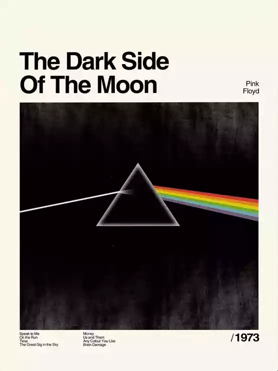
Without observers with the ability to see, there would be no colors. The understanding of colors can be said to have its foundation in the famous experiments carried out by Isaac Newton in 1666. Before this date, views on the nature of colors and the relationships between them were very vague and of little scientific use, but after Newton's work became known, the way was opened for progress based on experimental facts. Newton's historic experiments were carried out at Trinity College, Cambridge, when Newton made a small hole in the shutter of an otherwise completely dark room, one third of an inch in diameter (1 English inch is 2.54 cm). Through this hole, direct sunlight could shine and form an image of the sun's disk on the opposite wall of the room, like a pinhole camera. He then took a glass prism and placed it against the opening, observing that the light spread out into a pattern that he first called a spectrum: a strip of light, in this case about four inches long, colored red, orange, yellow, green, blue, indigo, and violet along its length. Newton quickly came to the natural conclusion that white light was not a simple homogeneous form, as was naturally expected, but was composed of a mixture of all the colors of the spectrum. For illustration, the band Pink Floyd used an image representing Newton's experiment on their album "The Dark Side of the Moon."
Figure 1: Cover of the album "The dark side of the moon" by the band Pink Floyd
Spektrálne farby a škála viditeľnosti
Another question that arose was whether these spectral colors, red, green, etc., were also mixtures and could be resolved into further components. To test this conjecture, another experiment was performed. A card with a slit was used that blocked out all the light of the spectrum except for one narrow band. This band of light, for example yellow or green, was then passed through a second prism, but the light was not resolved any further and remained exactly the same color as when it emerged from the slit in the card. It was thus found that the spectral colors are in fact the basic components of white light.
Newton's inclusion of indigo in the list of spectral colors is somewhat puzzling, as it appears to most people to be a gradual transition between blue and violet, with no distinct color in between, much like orange is between red and yellow. Several explanations for indigo's inclusion have been proposed, but the most likely is that Newton was trying to place colors on a scale of tones in a manner analogous to the eight-tone musical scale; to do this, he needed seven different colors to correspond to the seven different notes of the scale.
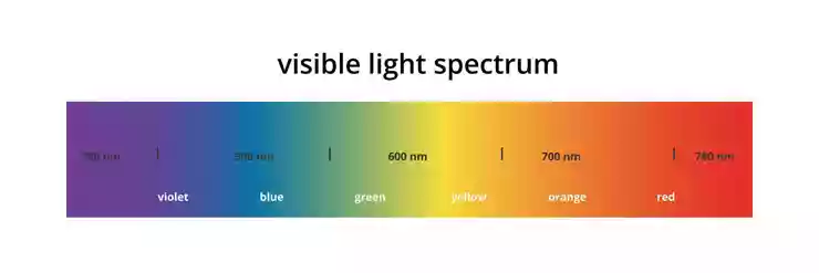
Figure 2 shows the main color bands in the spectrum on a scale of wavelengths of light. Light is a form of electromagnetic radiation, such as X-rays, radar, and radio waves, and the property of this radiation that gives it its unique characteristics is its wavelength. Radio waves have relatively long wavelengths, typically ranging from about one meter to several kilometers, while X-rays have extremely short wavelengths, typically about a millionth of a millimeter or less. Light waves have wavelengths between these values, ranging from 380 nanometers (nm) to 780 nm. To obtain convenient numbers for the wavelengths of light, the unit nanometer (abbreviated nm) is used to express them. This is one millionth of a millimeter or 10-9 meter.
Figure 2: Visible light color scale
Brightness, hue and color
It should be emphasized that the color names and wavelength boundaries shown in Figure 2 are only a rough guide. Each color gradually transitions into the next, so that there is no real boundary; moreover, the color appearance of light of a given wavelength depends on the conditions of observation and may vary slightly from observer to observer. Nevertheless, it is useful to keep the names shown in Figure 2 in mind when considering data that is presented as a function of wavelength. Radiation with wavelengths longer than those of the visible spectrum and shorter than about 1 mm is called infrared radiation, and radiation with wavelengths shorter than those of the visible spectrum and longer than about 100 nm is called ultraviolet radiation. This radiation can provide radiant energy that, for example, tans the skin or warms the body, but it is not normally perceived as light. Although color science has long used wavelength to identify different parts of the spectrum, it would be more appropriate to use frequency. This is because as light from any part of the spectrum passes through a medium, its wavelength is reduced by dividing it by the refractive index of that medium. However, its speed is also reduced by the same ratio, so the frequency (speed divided by wavelength) remains constant.
When it comes to colors, it is important to be aware of several perceptual attributes of color in the context of visual signals. There are three basic attributes, brightness, hue, and chromaticity, and they are defined as follows:
Brightness: An attribute of visual perception that makes an area appear to exhibit more or less light (bright and dim).
Hue: An attribute of visual perception that makes an area appear similar to one of the perceived colors, namely red, yellow, green, and blue, or their ratios.
Color: An attribute of visual perception that makes an area appear more or less colorful.
Practical use of colors
One of the most important practical uses of color is to help us recognize objects. However, objects can be illuminated under a very wide range of conditions; in particular, the level and color of the illumination can vary greatly. Bright sunlight thus represents an illumination level that is typically about a thousand times higher than that in a living room; and electric tungsten-filament lighting is much yellower than daylight. However, the human visual system is very good at compensating for changes in both the level and color of illumination. As a result of this adaptation, objects tend to be recognized as objects of almost the same color under a very wide range of conditions, a phenomenon known as color constancy. Color constancy is only approximate, and sometimes there can be significant variations in the appearance of colors, such as the tendency for colors that appear purple in daylight to appear significantly redder under tungsten light; nevertheless, color constancy is an extremely powerful and important effect in color perception.
Color identification
One of the most difficult technical issues facing advanced philatelists is the identification of stamp colors, or shades. A slight difference in color shades can have an economic impact that can vary by several orders of magnitude compared to other stamps of more common shades.
In 1978, Messrs. Tyler and Peck used diffuse reflectance spectroscopy in their study to distinguish genuine and counterfeit stamps of the Roman States issues from 1867 to 1868. This was an application of colorimetry, in which the results were obtained by a simple comparison of reflectance curves. In the final sentence of this work, the authors state: “It can be stated that this method has considerable potential for application in the philatelic field, since it allows the absolute characterization of color shades that could previously only be determined by subjective means”. In 1979, the Philatelic Foundation subsequently attempted to make a comprehensive effort to quantitatively study colors in philately. As a result, the Danish philatelist Norby stated: “It is necessary to resolve the indiscriminate and in some cases inconsistent naming of stamp colors.” Unfortunately, this situation persists to this day, after almost fifty years. This “first”, “reference”, “pioneering” work in the field of philately provides excellent background information on color theory, color chemistry, papermaking, printing techniques, and non-destructive methods of color measurement and analysis. The only substantial recommendation of the foundation was the proposal to adopt the very complicated set of color designations defined in the Munsell Color Book. Subsequently, in 1982, some conclusions were revised again, but the resulting complexity of color designations was far from “user-friendly”, and it is questionable whether any collector ever adopted any of the proposed conventions. Similar approaches were used by several subsequent studies. In particular, Chaplin et al., who used spectroscopic analysis to distinguish genuine from counterfeit Hawaiian missionary stamps (Figure 3), gained wide recognition.
Figure 3: 2-cent Hawaiian Missionary Stamp
Physics of light and color models
The physics and psychological perception of color encompass two distinct areas. The first is the pure physics of light and its measurement. For simplicity, we will call it spectrometric analysis. The second is the psychophysical manifestation of color by the human visual system, often called perception. Both of these areas are the subject of extensive study due to their numerous applications, including: pigments and dyes, inks, digital television, computer monitors, photography, and many others. One of the most important aspects of spectrometry is the ability to objectively measure color, which, as mentioned, is called colorimetry. Unfortunately, while the actual measurement of certain characteristics, such as reflectance or absorption spectra, is a well-defined physical phenomenon, the perceptual interpretation of this electromagnetic radiation by the human eye is far from precise. Color identification and comparison can vary significantly between observers, under different circumstances within the same observer, between genders, and between young and old people. Therefore, by definition, there is no exact answer to questions regarding human color perception. Instead, semi-empirical methods, often related to a specific problem area, must be developed and used to approximate the precise meaning of "color."
As mentioned above, it is generally accepted that color is the result of psychophysiological perception rather than an independent physical phenomenon. Specifically, it is the stimulation of the human visual system by so-called visible light. Although color cannot be measured directly, the conditions that lead to our perception of color sensations can be measured. Colorimetry involves the conversion of subjective responses, such as light blue, deep dark purple, bright gold, to an objective numerical system.
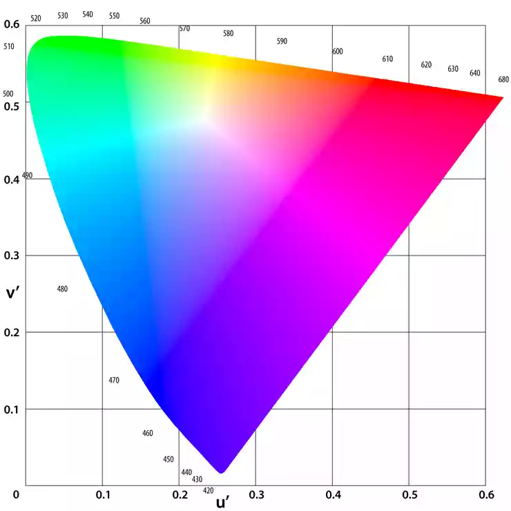
A method for this purpose was introduced in 1931 by the CIE (Commission Internationale de l'Eclairage - International Commission on Illumination). To measure the variables that create color perceptions, the CIE introduced a reproducible, spectrophotometric, device-independent color model created from the light source, the observer, and the object. The measurement and transformation according to the CIE result in coordinates (X (red), Y (green/yellow), and Z (blue)) that locate the sample in a horseshoe-shaped color space representing human color perception. Such color spaces are called chromaticity diagrams, an example of such a diagram is shown in Figure 4.
Figure 4: Chromaticity diagram
Later, the CIE L*a*b* color space was defined. It is based on the opponent theory of color vision, which arose from Hering's ideas. Hering pointed out that out of the thousands of words used to describe color, only four are unique: red, green, yellow, and blue. They are unique because they cannot be described without using their own color name, but any other shade can be described using one or more words from this set. Together with white and black, they form a group of six basic color properties that can be grouped into three competing pairs: white/black, red/green, and yellow/blue. The concept of opposition arose from the observation that no color can be described as having the properties of both red and green or yellow and blue at the same time. A red shade of green simply does not exist!
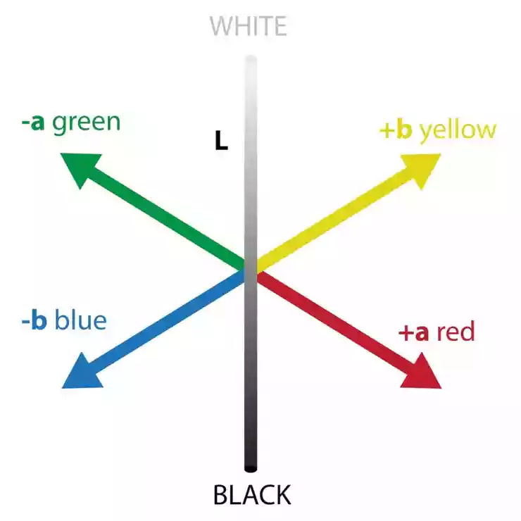
It seems reasonable to assign these three pairs of opposites to the three axes of a three-dimensional color space. On a color diagram, the degree of redness or greenness of a color perception could be represented by the distance along one axis, with pure red at one end and pure green at the other. Similarly, yellow and blue are the opposite extremes of a second axis, which could be placed perpendicular to the red/green direction. A third axis would run from white to black and lie in a plane perpendicular to the other two. The CIE L*a*b* space (1976) uses three terms to represent colors, L*, a*, and b*, as shown in Figure 5.
Figure 5: CIE L*a*b* color space
L* The vertical axis represents lightness: 100 represents a perfectly white sample and 0 represents perfectly black. The a* axis in the plane perpendicular to L* represents the red-green color quality. Positive values indicate redness and negative values indicate greenness. The b* axis perpendicular to both L* and a* represents the yellowish color quality. Positive values indicate yellowness and negative values indicate blueness. Since the L*a*b* values for a sample can vary with different combinations of illumination and observer, each color specification must always include the illumination and observer for which the values were calculated.
Color and lighting
As already mentioned, lighting plays a very important role in determining. In case of poor lighting when determining the colors of stamps, we may encounter a phenomenon called "metamerism". This is a phenomenon that is related to the integral perception of color stimuli. Which ultimately causes the same stamp to appear to us to have a different color under different lights (Figure 6).
Figure 6: Depiction of the color perception of objects under different types of light.
Identifying postage stamp color shades
The identification of the shades of postage stamps is a problem in their color comparison. After collecting data on the "color" of hundreds of samples, it nevertheless turns out that almost every stamp has a different "color" from a purely spectroscopic point of view, at least in terms of chromatic coordinates. The traditional way of determining color shades is actually done by categorizing colors rather than comparing them. Manually determining the shades for a family of similarly colored stamps is a simple process. However, this simple statement underestimates the requirement of having an expert philatelist whose color acuity has been honed by thousands of hours of training. This requirement is confirmed by the fact already mentioned, which shows that the ability to distinguish and recognize colors is highly variable between individuals. In general, a color expert samples many hundreds of stamps of a given value and issue. For the vast majority of stamps, there are many shades resulting from different presses, different ink batches, different plate treatments, different paper dampening, different pressures on the plates during printing, and many other aspects (such as the degradation of the color over the years due to environmental factors). Although many of the color names were first defined in the 19th century, they are still commonly used today. For example, shades including orange-brown, dark orange-brown, copper brown, dull red, burgundy, and others are used. The result of this categorization is even more complex. Within each of these categories, which are generally determined by chroma or base color, there are many gradations, such as light to dark. Although this primarily ad hoc procedure has been refined over the years, the question remains. Can a theoretical basis be defined for this methodology?
Literature
© McLaren, K., Newton’s indigo, Color Res. Appl., 10, 225–229 (1985).
© Billmeyer, Jr. FW, Saltzman, M. Principles of Color Technology, 2nd Edition, New York. Wiley-Interscience, 1981.
© Wyszecki, G, Stiles, WS. Color Science: Concepts and Methods, Quantitative Data and Formulae, 2nd. Edition, New York. Wiley-Interscience, 2000.
© Ohno, Y. CIE Fundamentals for Color Measurements, Proc. NIP16 International Conference on Digital Printing Technologies, Society for Imaging Science and Technology, 2000: 540-545.
© White RH. Color in Philately, New York: The Philatelic Foundation; 1979.
© Kelly KL, Billmeyer, Jr. FW. APS manual for determining color designations of stamp colors. Amer Phil 1981;8:709-717.
© Nickerson, D. History of the Munsell color system and its scientific application. J Opt Sci Am 1940;30:575-580.
© Chaplin TD, Jurado-Lopez A, Clark RJH, Beech DR. Identification by Raman microscopy of pigments on early postage stamps: distinction between original 1847 and 1858-1862, forged and reproduction postage stamps of Mauritius. J. Raman Spectrosc. 2004;35: 600-604.
 Slovenčina / Slovak
 Angličtina / English



_ZZ3_nahlad_velkym_2142.webp)
_ZZ3_nahlad_velkym_2141.webp)


